Website Case Study | Dolce Living
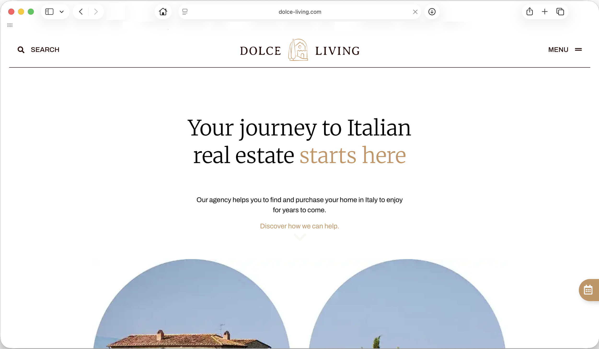
Homepage BEFORE
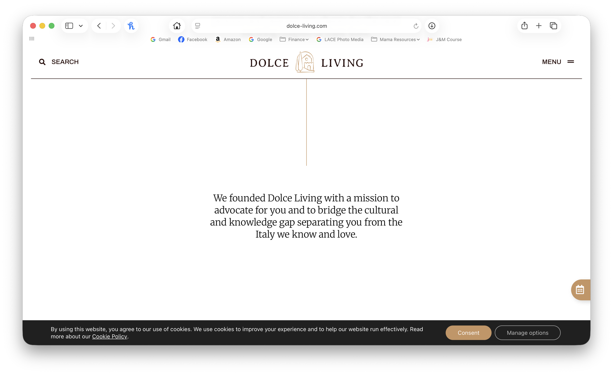
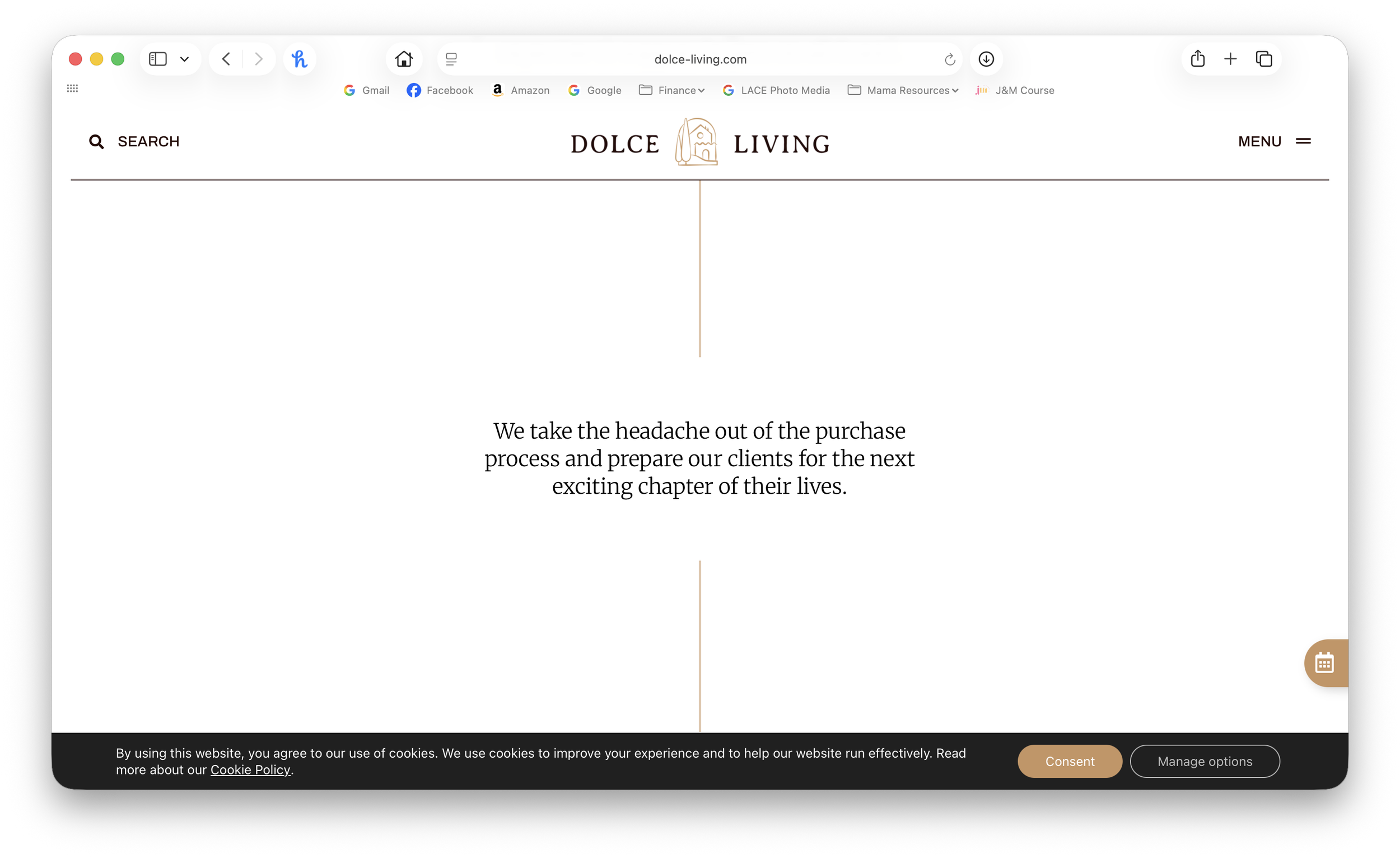
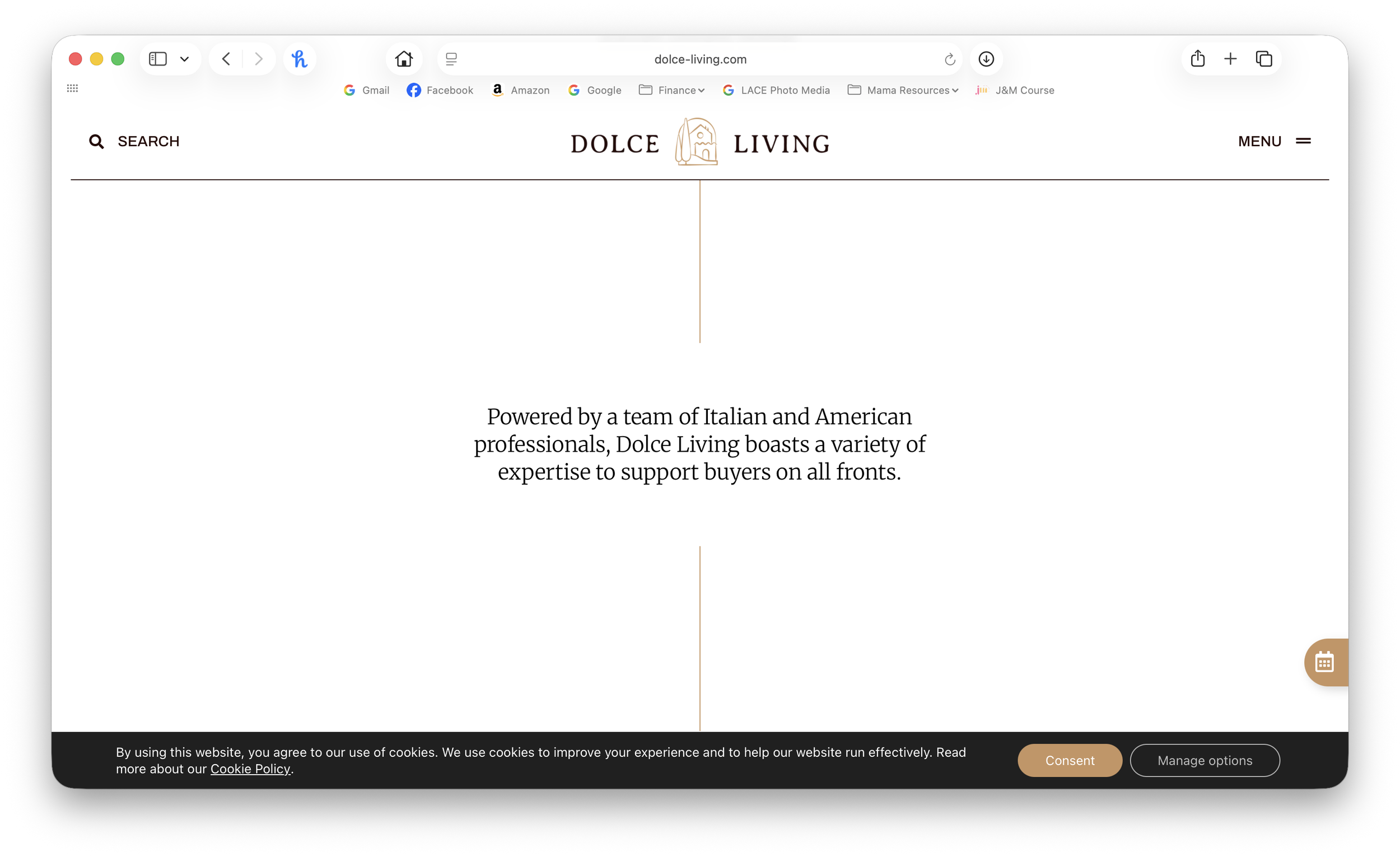
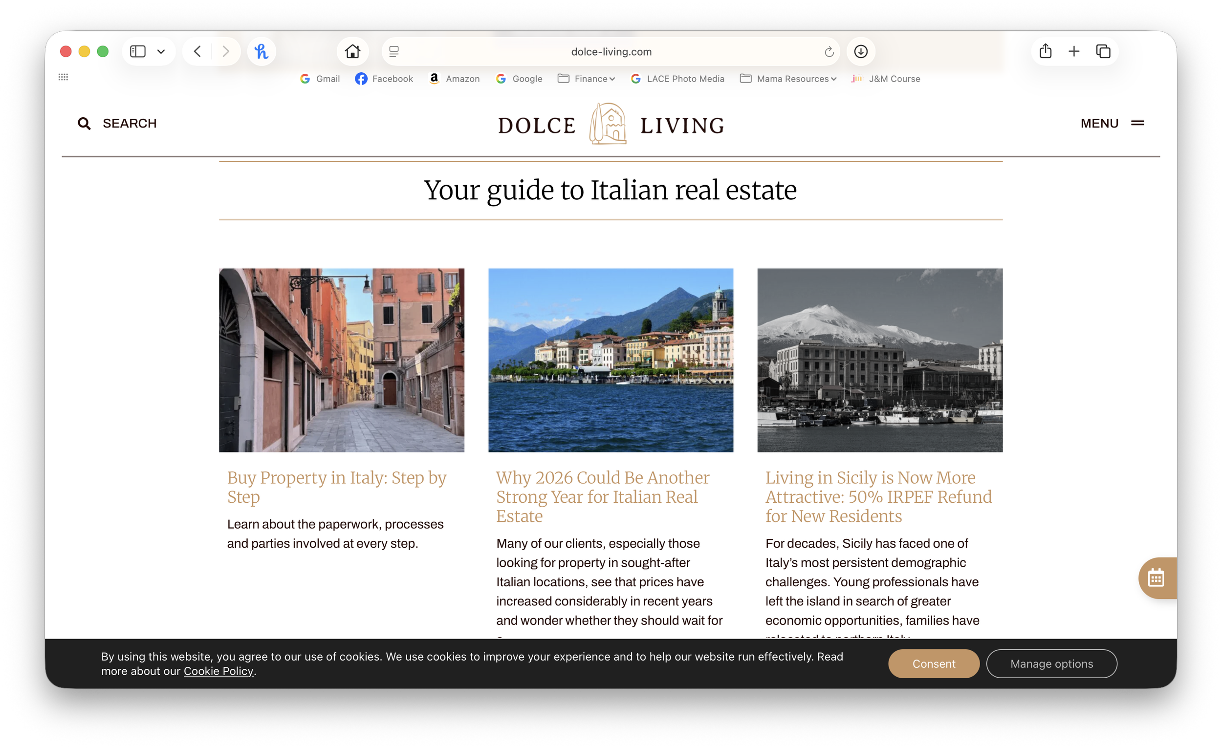
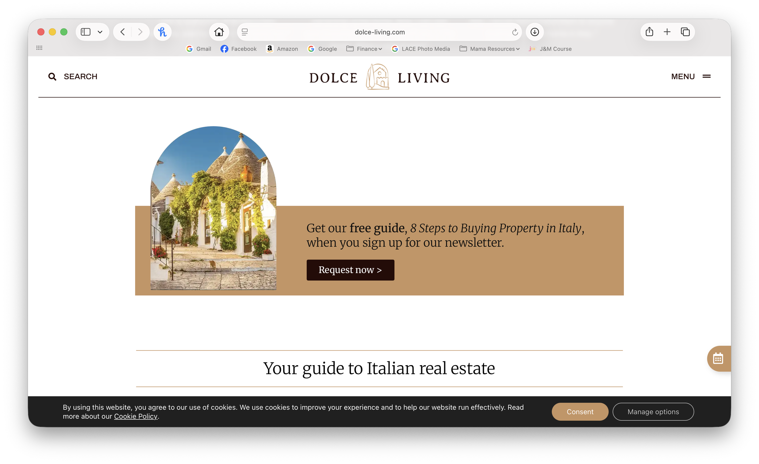
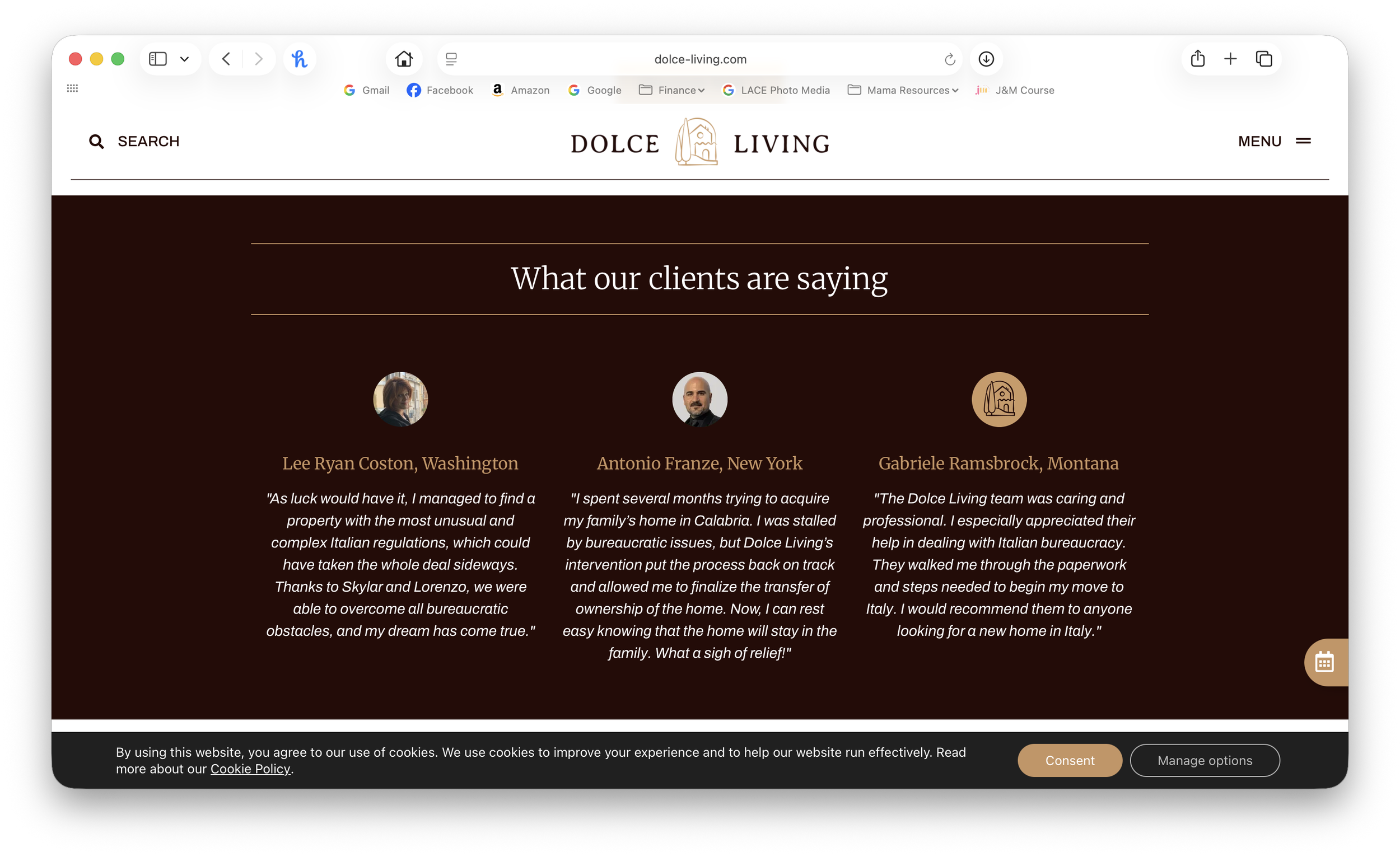
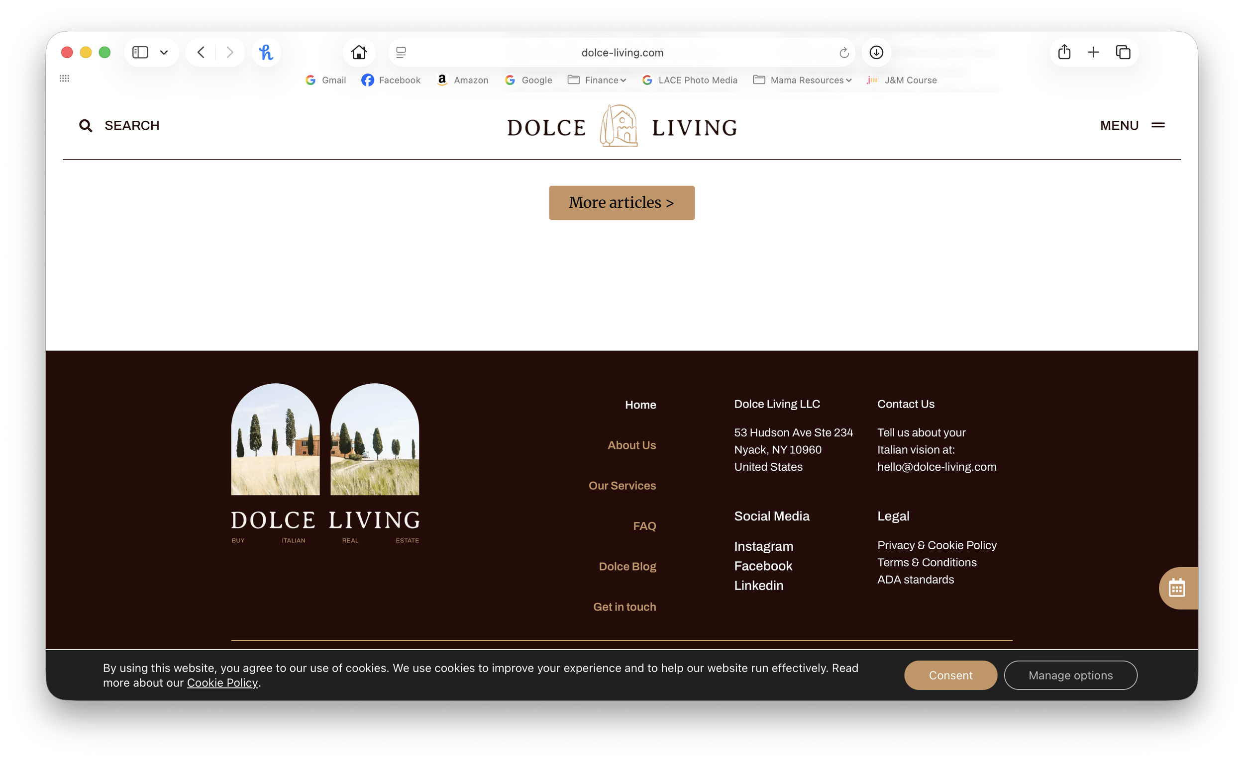
The Problem
-Text heavy
-Excessive scrolling for a small return of info
-Images ‘below the fold’ were a missed first impression
-Lacking a clear call to action was a missed opportunity for client conversions
-Did not appear high end or feel like a premium service
+The Ask: Keep the copy + the branding but make it high end

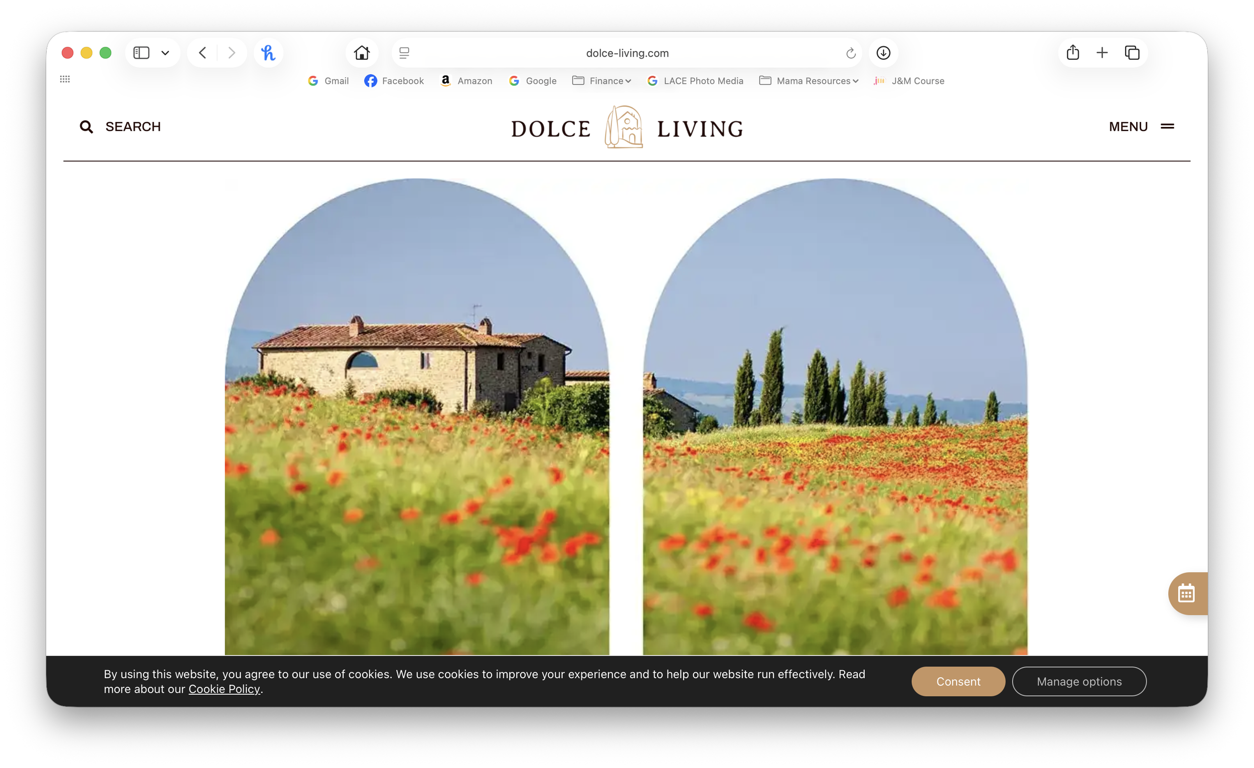
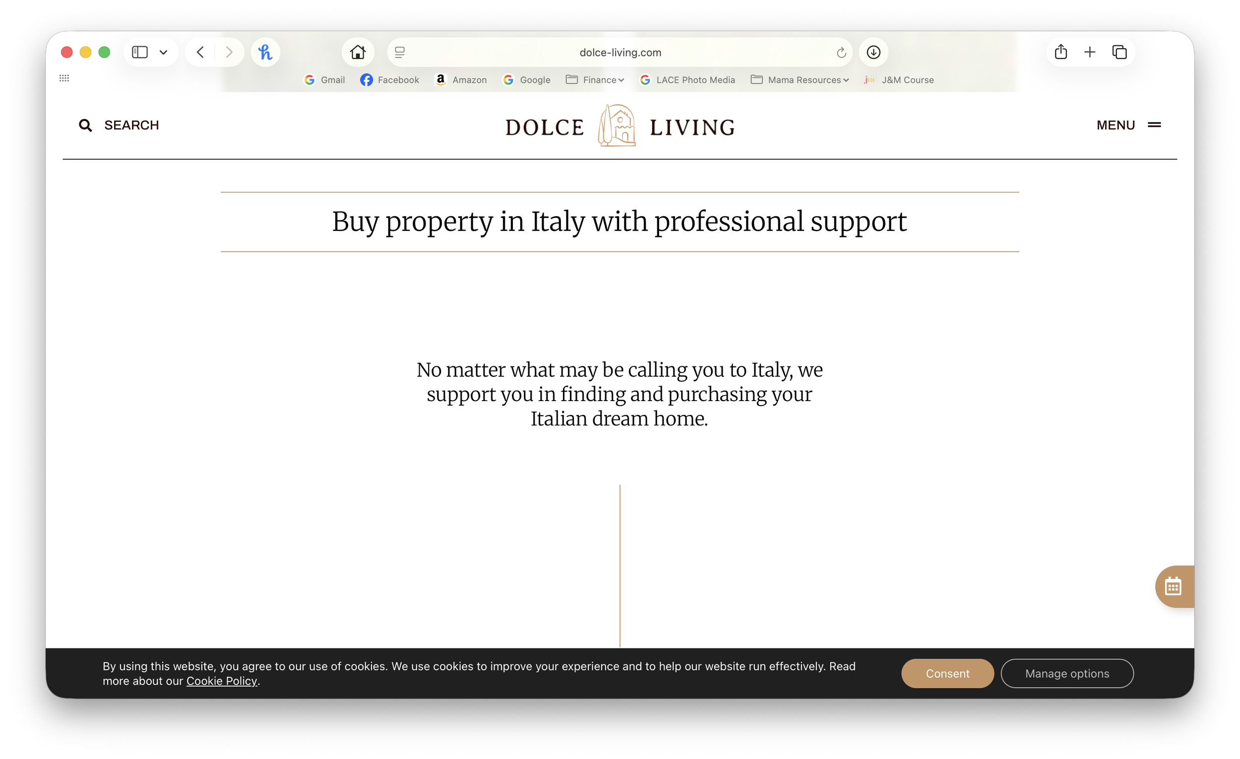
Homepage AFTER
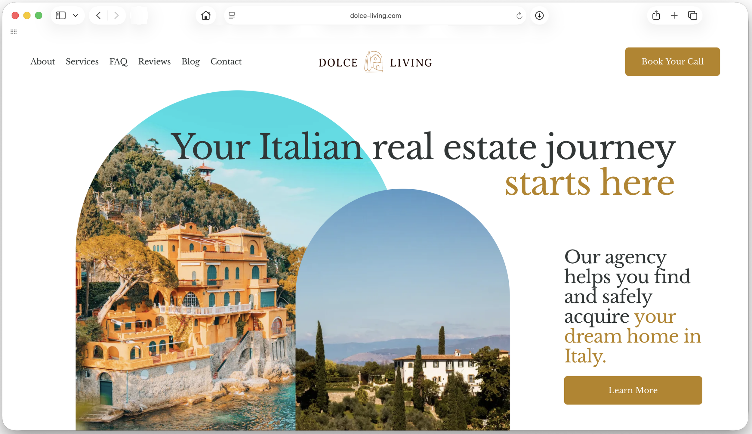
The Solution
+Image forward ‘above the fold’ for immediate visual cues that point to their service
+Messaging and visuals speak the same brand language
+Limited scrolling leads to timely + intentional information delivery
+Clear call to action for increased client leads and conversions
+Editorial style layout for a high end feel that points to their premium service







Custom branded graphics align copy with visual messaging
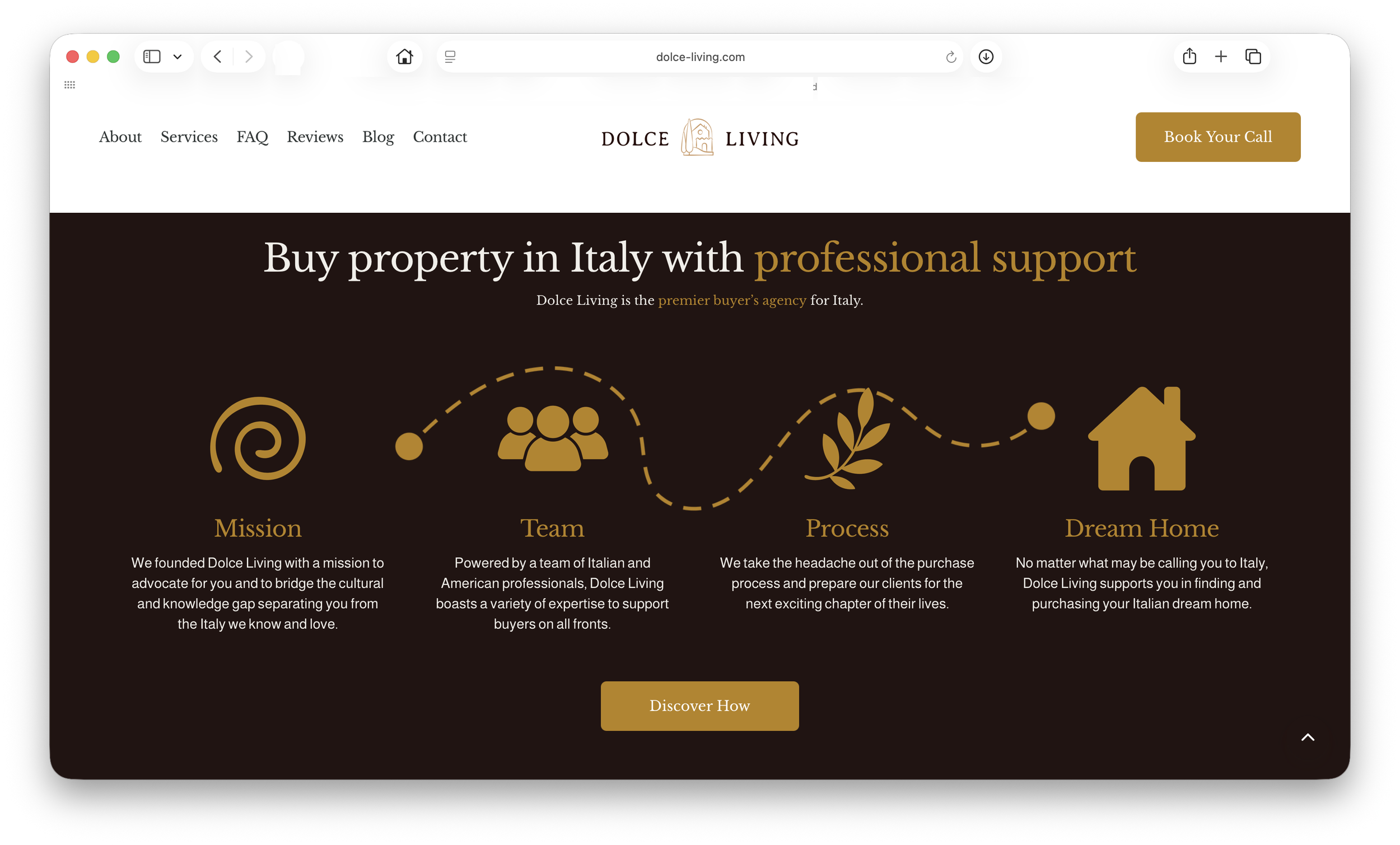


Explore the full website here: https://dolce-living.com
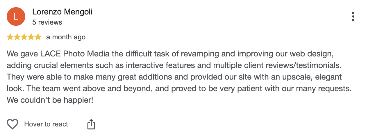
The reviews are in and Dolce’s experience was just as sweet as their new website